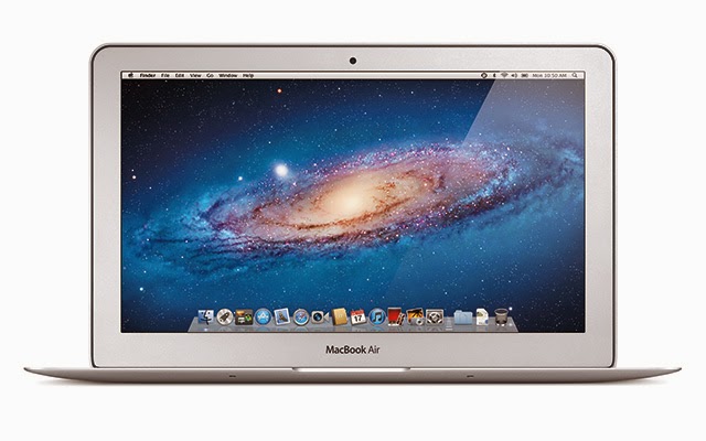
It's been quite a week. I finally got my Macbook
Air (11.6" / i7 2.0ghz / 8GB RAM / 128GB
SSD), on Monday and I love it. It's the fastest computer I've ever used, but
it's scary. No expandability or upgradability or serviceability. With some
specialty tools, I
could, in theory replace the SSD or battery. But for me, the trade-off is worth
it. It's small, thin, light, and fast. I thought the 11" screen would be too
small, but it's just fine for much of what I do on the go. I'm glad I got it
over the 13", despite the larger screen and battery. Speaking of battery life,
it's good enough—I get about 4-5 hours on a charge. Not the 7-8 hours I'd
get on one of the Pro's, but it's more than usable. It's the first laptop I've
owned that I actually use on battery regularly. My old 15" Dell Latitude (1.8ghz
Core 2 Duo) when it was new, barely got an hour of active use on
battery—it always estimated that I had like 5 hours left when I was on a
full charge, but 10 minutes later, that would go to three, then 1.5, then I'd
get a low battery warning after about 40 minutes. This device actually delivers.
So, 2 days after I got my first Apple laptop (my previous ones were Dell's
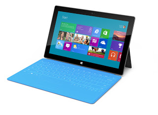
running Linux and Windows dual-boot), Microsoft announces its new Surface
tablet. And though this tablet is vaporware (no release date, no specs, no
price—real light on details), it's the most interesting hardware announced
this year. And yes, interesting PC hardware from Microsoft.
So let's back up. With Windows 8, Microsoft is going in a decidedly different
direction than Apple. Which in my opinion, is good -- how do we move forward if
everyone just does more of the same? Apple is clearly segmenting their products
into different categories: 1) phones and tablets running iOS, primarily
designed for more casual use cases and content consumption, and 2) full personal
computers running OS X, with fewer restrictions and geared towards getting real
work done. Though there's a strong relation between the two, they're clearly
different devices designed neatly for different specific use cases. Microsoft,
on the other hand, is going for a no-compromise, "Windows everywhere" type of
approach. Phones, tablets, laptops, desktops, game consoles, etc., all running
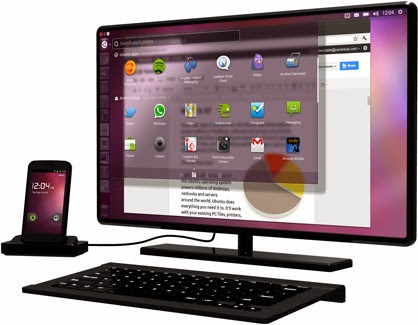
Windows 8 variants. The Intel variant of Surface, their new tablet concept, is
running a full-blown version of Windows 8. You can run all the same apps and
games and the like you would want to run on this device. It's got a magnesium
chassis with a unique manufacturing process. It has a built-in kickstand. And as
an optional accessory, it has a screen-cover, that when peeled back, becomes a
full keyboard and trackpad.
So, get this—you get a full-featured tablet-optimized experience with
Windows. It can, if you want to, run all the same desktop apps you're used to.
And it might just be able to replace your laptop, even if you're a user that
needs Office or Photoshop or Eclipse or whatever to do your day-to-day work.
That's something no one else is providing right now. And it's doing so in a very
elegant manner.
Sure, there are clunky keyboard cases for the iPad. There are products like the
ASUS Transformer on the Android side. There are new Windows 8 concept hybrids
coming out this year or early next year. But none of those are terribly elegant,
and they're all very expensive and bulky. If Surface pans out, it will be the
first beautiful, well-designed pure tablet that can act as a laptop replacement.
That's a game changer.
One big question everybody seems to have is why would Microsoft release a PC?
Isn't that a conflict of interest with regards to the OEM's it typically relies
on and partners with? Is it potentially foolish to compete with their own
partners? I say no, based on a number of things. First, what are their OEM
partners going to ship with instead of Windows? Linux? Not a chance. The Linux
desktop is still not a good fit for ordinary people. Apple doesn't license OS X,
so that's out. So this will frankly cost them nothing in terms of OEM loyalty.
The real reason they did this, in my estimation, is to give the OEM's a kick in
the pants. Why can't any of them match Apple in terms of industrial design and
overall hardware quality, even at higher price points? Intel has been spending a
ton of money subsidizing the OEMs' R&D and marketing for making "Ultrabooks"
(i.e., Macbook Air clones), and all of the designs have been crap, or
overpriced, or both. They just can't get their acts together. I think this is
Microsoft effectively showing how it can be done. Microsoft, a software company,
is showing up Dell, HP, Samsung, etc. in hardware design and development.
They're also showing them that they're not necessarily needed; Microsoft can do
its own thing.
We haven't seen the final, finished product yet, and won't until at least
October. Windows 8 itself is a huge gamble that Microsoft is betting the company
on, as it's so different. As a UNIX nerd, I'm unlikely to ever go to Microsoft
for my daily driver if I can avoid it, but I have to admit, I like their moxie
of late. I can imagine a world where XBox, Windows Phone, and Windows 8 devices
all coexist and are equal citizens of a digital ecosystem within a household.
It's exciting.
We're entering a more agile, mobile age. We do work everywhere, and on the go.
We answer emails in the elevator and on the subway, try to code and write
documentation during meetings, and just get work done in a very limited
schedule. Whether this is good or not is irrelevant; it's what's happening. In
corporate America, there's no stopping it, at least if you care about career
advancement. Being able to respond quickly, and get more work done gives you a
competitive advantage. Whilst the
distributist part of me laments
this development as yet a further step to serfdom, but my inner pragmatist is
unwilling to yield that advantage to my competition, as I need to feed my
family.
I do so much work on my smartphone in a day. I do research on-the-fly in
meetings in anticipation of questions. I schedule meetings. I write a lot
of email and documentation. I check the status and even deploy production code
to servers. I occasionally even—gasp—take phone calls. But there's certain
things I can't do efficiently. I can't type fast enough on my phone to take
effective notes. I can't do any serious coding in meetings where I really don't
have much to contribute. Lengthy emails are difficult. Complex formatting, hell,
even Markdown, is incredibly
difficult, and at times impossible. Part of it is the size of the device, and
part is the lack of a physical keyboard. Sure, I could bring an
iPad with me to all these meetings, but
that's still not great to type on, and the productivity applications are
generally stripped down from the desktop versions. My laptop is too bulky, and
it takes way to long to wake up from its slumber. And it only gets about 2 hours
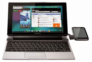
of battery life. I could get a Transformer
Prime with
the keyboard dock, but that's nearly as bulky as most laptops, doesn't have the
software selection that the iPad has, so it becomes the worst of both worlds.
ASUS Transformer Optimus Prime with keyboard dock.
I'm likely going to get a 13" Macbook Pro at
work in a month or so, which is much slimmer and lighter than my current HP
monstrosity, and though Lion does wake and sleep pretty swiftly, it's still not
as instant as my phone. And it's still a bulky thing to bring to every meeting.
What I'm really tempted to do is ask for an 11" Macbook
Air instead. It's nearly as small as an iPad,
and the SSD inside allows it to wake very, very quickly. But it just doesn't
have enough juice to compile large Java apps and run Photoshop effectively. And
let's face it: 4gb RAM is way too little these days for doing anything serious.
11" Macbook Air. The sexiest laptop ever made. Not much bulkier than an iPad.
Thunderbolt, however, gives promise to this sort of approach. 4 PCI Express lanes over a 3-foot cable adds lots of flexibility. Apple's Thunderbolt Display is a really convenient combination of a monitor and docking station, without the clunky ugliness of modern dock connectors. Some manufacturers are taking this further, with external boxes that have a power supply, ethernet port, USB ports, and a PCIe x4 port for a graphics card. The wimpy integrated GPU in the Macbook Air could get a boost from external graphics for gaming and professional 3D. This would offer a wonderful balance between portability and power when you need it.
But why not take it further? As Thunderbolt's successors become faster, why not
have external CPU and banks of RAM? Windows, Mac, and Linux are already
NUMA-aware. Why not add hot-plug CPU's to the equation?
Motorola Lapdock 100 driven by an Atrix 2.
Taking this further still, why not have Macbook Air or so-called "ultrabooks"
deployed with low-power, low-cost ARM CPU's, that could then be augmented with
higher power CPU's when docked. Surely, this would lead to gains in efficiency
and thus battery life.
Further still, what about equipping phones with whatever the successor to
Thunderbolt is? Clearly, iOS is on a collision course with OS X. Ubuntu has
already annouced Ubuntu for
Android that allows
you to connect your phone to a monitor with an HDMI port and boot a full Ubuntu
desktop that syncs with the phone. Microsoft is already waving the "Windows
Everywhere" flag, positing that Windows 8 will be available in various flavors
on the next XBox, PC's, and tablets, ARM-based netbooks, and likely eventually
phones. Hell, Motorola deployed a similar, if flawed, attempt at this last
year with the Atrix
4G
coupled with the
Lapdock.
The Ubuntu on Android solution, to me, is very exciting in the short term. I use
Ubuntu on my home laptop and desktop for, well, everything that's too big for a
phone. I've also, recently, decided that I'm never going to buy another desktop
machine. The biggest issue with a desktop is you have to go to your workstation
to use it. I've found myself doing the vast majority of my browsing on my phone
out of convenience, and as a result, I sit at my desk a lot less, and am less
likely to just spontaneously start coding. A laptop solves this problem. Even
moreso, a phone that can plug into a laptop dock or a desktop dock with 24+"
monitor, keyboard, and mouse lets me continue my actions with the same device
with a different display.
I honestly believe this is the future: one device to rule them all, and a
multitude of input/output/augmentation devices such as laptop "shells", media
docks, desktop docks, etc. allowing greater flexibility. It's happening.
It'll continue to happen. And it can't happen soon enough.
So... I've been doing the "Inbox Zero" thing for about
2 months. I've actually been really great at keeping up with my personal email,
less so at work, where I'm barely treading water. I attribute this to three
factors:
I get 10 times the volume of work email than I get personal email
For my personal mail, it's really easy to split things into "I need to care about this" vs. trivial email that I can safely delete without reading. This is not the case with work email.
Gmail is very, very different than Microsoft OutlookI'll never be able to do anything about #1; that's simply beyond my control. I suppose I could get slightly better at #2. #3 is where I really, really need to keep moving and improving at my Outlook skills.
For personal email, I heavily use filters. Heavily. Gmail's filters allow me to
apply a plethora of labels on an email/conversation, while still leaving them in
the inbox. This is huge to me. The Inbox, to me, is the place for stuff I
haven't dealt with yet. This is important. Once something leaves the inbox, I've
dealt with it. Because the filters apply the tags (Gmail's replacement for
folders) to the email whilst it's still in the inbox, I can simply hit "archive"
when I'm done with it. It's no longer in the inbox, but it is still accessible
when I'm filtering by the particular tag(s) that are applied to it. Adding to
the usefulness of this is Gmail's conversation view -- additional replies to a
thread automatically have the tag that I gave it! And the whole thread comes
back to the inbox when a new message in the thread comes in. Brilliant! So easy
to get context!
For work email, I don't use filters at all, because I want stuff to stay in the
inbox. My default view is sort by flag. My inbox tends to fill up by the end of
the day, because it's cumbersome to triage them from my phone by moving messages
into the appropriate folder; whilst in Gmail I simply hit archive, using
Exchange through ICS's regular email app,
it's a many-tap affair. I switch back-and-forth between sort-by-folder and
sort-by-subject to get context for entire conversations, and drag things on
Outlook 2007 into the appropriate folder in the complex structure I've erected
for things that I need to save, as well as the "archive" folder for stuff that I
don't know how to classify.
If my company's Exchange server allowed
POP3, I'd simply do all of
this through my Gmail account; my life would be much faster and easier. But that
would break nice integration with my work calendar. Ugh.
Am I doing this wrong on Outlook? Is there a better way?
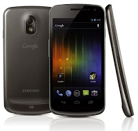
The last 1.5 years has been a wild ride for me, switching from a prepaid
dumbphone user to owning a top-of-the-line (at the time) Android
phone: the Samsung Captivate
for AT&T. It enabled me to work more efficiently and flexibly, and enjoy the
benefits of always-on Internet access. But it wasn't without its faults. As I
detailed on a previous post (Thoughts on
Android), there were a number of
issues with the device, and Android in general. The Galaxy Nexus, the first
phone running Ice Cream Sandwich (Android 4.0), is, in my personal opinion, the
best phone in existence today. I purchased the global GSM version
off-contract from an importer, and am using it on AT&T.
Hardware
In a world saturated with high-end dual-core phones, including but not limited
to: the Motorola Atrix 4G, LG
G2X, Motorola Droid
X2, etc. bundled with any number
of radios and gadgets, the internals to the Galaxy Nexus are quite pedestrian
for a high-end phone. Dual-core, 1+ghz
CPU?
Check. 1GB RAM? Check. 16-32GB internal storage? Check. Bullet points - nothing
more. Hell, the GPU is the same PowerVR
SGX540 as
2010's Galaxy S and Nexus S phones, and is actually a step behind some
recent phones, notably the Mali 400 in the Samsung Galaxy SII and the PowerVR
SGX543MP2 in Apple's iPhone 4S. So clearly pretty pedestrian.
What is notable? First, the inclusion of NFC, although this was also on last
year's Galaxy Nexus. Second, the inclusion of a barometer, which supposedly
helps with GPS. Third — and this is big — a pentaband GSM radio that handles the
frequencies of almost all major worldwide carriers, notably AT&T and
T-Mobile in the US. One SKU, all GSM carriers.
Although, quite honestly, the most interesting hardware on the device is the
screen — a 720p 4.65" Super AMOLED display. Sure, the Rezound beat it to the
punch of ~300dpi, but only by a couple weeks. This is, frankly, an amazing
screen. I was slightly worried that it would be too big for me. On the contrary,
not only does it fit easily in my pocket, the large screen has honestly changed
my usage habits. I read on the device a lot more. Long-form reading, too. So
far, I've read a good chunk of a book on game theory, the first third of
Xenophon's Apology (an alternate record of Socrates' trial that I'm contrasting
with Plato's account), and lots of articles on the web that on my Captivate, I
would have otherwise tagged for later reading due to their size. The sharpness
of the screen helps to this end as well — it's nearly as easy on the eyes for
text as the iPhone 4/4S screen. 99% of the time, the fact that it's an RGBG
Pentile matrix doesn't bother me in the least — large fields of solid gray look
a bit off, however. All-in-all, it's a gorgeous screen.
As far as the industrial design goes... it's pretty nice. It doesn't hold up to
the recent high-end designs by Apple or Nokia, but it looks and feels high-end.
I love that the front face is just a solid slab of black, unadorned with any
carrier or manufacturer logos. Overall, the design is a clear iteration on
Samsung's Nexus S from one year ago — the slightly curved screen and overall
shape are similar. The Nexus S, however, had a very cheap, plasticky-feeling
glossy back cover that just ruined the otherwise great presentation. The
textured back of the Galaxy Nexus, by contrast, looks and feels a bit more
rugged. It doesn't have the same solid feel as phones made by Apple, HTC, or
Nokia, but it's moving in the right direction. If I had one major criticism of
the feel of the device is that it feels lighter than it looks like it aught to.
In fact, because of it's thinness and lightness, I can't feel it in my pocket,
and it's slipped out a few times. I purchased a case for it just to make it feel
thicker.
The camera is okay. Better than any camera I'd had on a phone before. It's
really, really fast. The speed isn't something I knew I cared about, but after
getting it, I've caught a lot more quick, casual pictures of my daughter, and
that's something I constantly failed at with my Captivate and my Canon
point-and-shoot. The quality is decidedly passable, assuming a fair bit of
light. There's really not much else to say; photography isn't my thing. If the
camera is really important, this probably isn't the phone for you.
Software
But honestly, other than the screen, there's not much too interesting about the
hardware. The real story here is Ice Cream Sandwich (ICS). First of all: wow —
what a huge change! Most of the complaints I had about Android are gone.
With respect to performance, there's almost no perceivable performance
difference between ICS and iOS 5... with a couple of exceptions. The biggest
case of slowness is apps that are built for older versions of Android and don't
have hardware accelerated drawing enabled. This is a big one, and
in normal apps, there's pretty much no excuse for this. In most cases, it
requires a line added to an XML file, and then a recompile. But the fact of the
matter is, plenty of high-profile apps that at the time of this writing don't do
this (I'm looking at you, official Twitter client!) So for a while, we're going
to run into this. The second case of slowness is games that are GPU-limited —
1280x720 means a lot of pixels to fill, and the decidedly last-gen GPU isn't
always up to the task in some games, particularly compared to the monster GPU in
the iPhone 4S. Finally, there's occasionally slowdowns with heavy use of
multitasking. Android doesn't put any limits to simultaneous background
processes and the like, and I've particularly noticed it when I'm downloading
multiple files, which I'm assuming is I/O bound, since the flash memory on this
class of devices is quite slow.
Figure 1: new soft navigation buttons. From left to right: back, home, and task switcher.
Second, the user interface has largely be rethought and redesigned. The first,
most noticeable change that the user will observe is the navigation buttons.
Android has oft been maligned for the confusing 4 Android buttons: home, back,
menu, and search. These are present on all Android devices as hardware buttons.
This was particularly confusing if you ever switched phones — it seems no two
manufacturers used the same order to the buttons. This is all changed with ICS
on the Nexus. First, they removed two of them, search and menu, and replaced
them with another: the task switcher button. So at the bottom, you have three:
back, home, and task switcher. They disappear when viewing full-screen video and
other similar things, which is nice. They provide visual feedback when pressed.
And overall, it's less cluttered and confusing. The task switching button is
fantastic — with a single tap, it brings up your most-recently-used app list,
along with thumbnails of the apps. I rarely used the task switcher on
Gingerbread or iOS, because invoking it was annoying (long-tap home and
double-tap home, respectively).
Figure 2: new build of Google Reader with Action Bar at the top. The vertical ellipsis at the top-right is the "Action Overflow" button
The removal of the menu button, as of right now, is both good and bad. It's
great if you use apps built to target Honeycomb and later. Instead of a fixed
menu button, a contextual "Action Overflow" button may appear in the upper
right-hand corner of the app in its Action
Bar, which is part
of the newer Android 3.0+ UI paradigm. The idea is that if there are more action
buttons than can fit into the Action Bar, they go into the overflow area. If,
however, you're using a legacy app that targets Gingerbread of prior, the Action
Overflow button appears in the extreme right of the navigation bar, to the right
of the task switcher button. A small handful of apps, such as Rom Manager, have
it in both places! The combination of these two models is confusing at best, but
it will go away. It makes me want to recommend against ICS for non-technical
users at the moment, because this alone is really, really weird and hard to
explain.
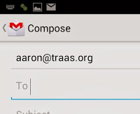
Figure 3: Action bar for Gmail app with the "up" button in the upper-left
Speaking of the Action Bar, I think it's really an improvement to the design of
Android apps. The apps that have it typically make good use of it. It has an
additional navigational element, often a view selector, and a list of common
functions that would otherwise go into a menu, as well as often a pull-down
menu. Very functional and intuitive... except what appears to be an alternate
"back" button. In the upper-left corner is typically the app's icon, often with
a left-facing chevron. When I first got the device, I assumed it was a second
"back" button. But it behaves differently than the back button, which just pops
views off the activity stack. Though the hard back button is a bit unpredictable
for people unfamiliar with the internals of Android, it appeared that we had a
second back button that behaved even weirder. However, according to the recently
released Android Design
documentation from Google, it's not a back button, but an "up" button. Whilst
the "back" button simply traverses backward through your stack of Activities,
the "up" button goes to the parent Activity or Fragment to the current one.
Simple, right? No. It's really not. The fact that I couldn't figure it out
without referring to Google's style guide, that implies a failure of design.
Seriously, have a look for
yourself. Is it a
useful paradigm for those willing to read the flow charts? Absolutely. Is it
intuitive? Nope. At the very least, it should have been an up arrow rather than
a back arrow to give the user a little bit of a clue.
The launcher bundled with ICS is much improved over previous ones. Google
clearly took several cues from popular third-party launchers like Launcher Pro
and ADW, as well as the stock Honeycomb launcher. It's really, really good. One
complaint I have is that I prefer the vertically scrolling app drawer of older
launchers to the side-to-side paging app drawer of the ICS launcher. That being
said, I'm still using it — it's that good.
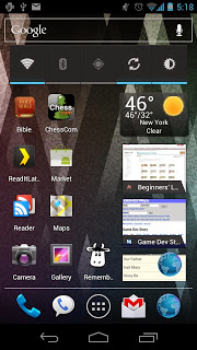
Figure 4: Stock launcher in ICS.
The browser is great — it's fast, responsive, and makes great use of the huge,
crisp screen. The UI is streamlined, and the navigation controls auto-hide
themselves, freeing up yet more screen space for the actual browsing. It take
some definite hints from Chome in this regard: the web site is the app, and the
best thing the browser can do is get the hell out of the way. The scrolling is
quick, although I've seen it slow down a little in image-heavy pages. Again, I
suspect GPU fillrate and/or memory bandwidth limitations here.
The battery life is much improved over Gingerbread, at least in the
unadulterated Google flavor of ICS. The battery life is really
acceptable—I typically have 30-40% left at the end of the day if I stay in
Jersey, about 10-20% if I spent all day in NYC.
The new font, Roboto, is a big step up from Droid Sans. It's a lot like
Helvetica, and a little like Din. It's overall a nicer, more elegant font. At
smaller sizes it's more readable than Helvetica, and a lot of that has to do
with the more "open" glyphs, particularly lowercase "e". We'll have to see how
it translates to lower DPI devices.
There's lots of other little things... face unlock is neat, but I don't use it
for more than showing off what my phone can do. Android Beam is cool... if I'm
hanging with one of two others I know with a Galaxy Nexus (why didn't every
manufacturer build NFC into their phone?) I haven't yet tried Google Wallet, as
there's no support yet. Being able to drill-down and tightly analyze your data
usage, and restrict individual apps to never use background data and the like
is, frankly, great, but not something the majority of users will use. The
keyboard is improved. Cut and paste is finally done right and implemented
consistently. And, frankly, the new design of the OS is mostly clean and
cohesive, and actually feels like a design, which you really couldn't see in
earlier versions.
However, according to Google's design goals, particularly that of simplicity, I
think they failed. Because of the menu debacle and the confusing "up" button,
honestly they've added complexity. I absolutely love ICS because of the power it
gives me. For a non-technical user, my recommendation would still be the iPhone
4S over this phone, unless they make heavy use of Google's apps and ecosystem,
or are on T-Mobile. For a serious power user who relies on his phone for work
and information, it's hard to beat this phone. And though it has a few warts, I
do feel, finally, that Google is really going in the right direction. Hiring
Matias Duarte away from HP was one of the best decisions they've made. As nice
as Ice Cream Sandwich is, I'm really, really looking forward to Jelly
Bean.
What's happened to Research In Motion, the company that produced the
legendary Blackberry brand, that until 2 years ago, was the gold standard
for professional smart-phones. Professionals everywhere loved them, as they
allowed one to receive email on the go, and reply rapidly with
best-of-breed QWERTY keyboards. Blackberry Enterprise Service allowed
corporations to install private, encrypted servers that would send
push-notifications to their corporate Blackberry devices and integrate with
Microsoft Exchange email servers that are the workhorse of email in corporate
America.
With the introduction of the Blackberry Curve in 2006, they started attracting
consumers as well, as more and more people wanted email on the go, and
Blackberry Messenger—the former best-in-breed mobile instant messaging
application to this date. PalmOS and Windows Mobile were waning, particularly
among corporate types, and it looked like RIM would have a bright future ahead
of it, until of course June of 2007, when Apple released the iPhone. RIM, like
all of Apple's soon-to-be competitors, scoffed at Apple for a number of reasons:
the iPhone was $600 on contract—a full $300 more than the next highest phone.
It lacked key features: Microsoft Exchange integration, 3rd-party applications,
cut-and-paste—the list goes on. But unlike all smartphones of the past, it
was beautiful, elegant, responsive, and easy-to-use. A few months later, Apple
dropped the price, and adoption exploded among consumers. RIM and Microsoft
still laughed, saying it would never make inroads in corporate America.
But it did. It gained all of the key features it lacked, and became more
beautiful, faster, and easier to use. Android also came onto the scene,
exploding with the release of the Motorola Droid on Verizon in 2009. The
two-pronged attack from Apple and Google is today absolutely destroying RIM, and
rightfully so. RIM did absolutely nothing until 2010 to combat this onslaught,
where they purchased the QNX operating system and started work on the Blackberry
Playbook, a tablet that doesn't support email, which has always been RIM's
bread-and butter. No phones will support the new OS until at mid 2012.
Now, this isn't to say that QNX is a bad OS, or that it can't eventually be
competitive, but it's no where close to being ready, and RIM's failure to
execute in 2011 could spell its doom. But I'm going to pose two alternatives
that would have been much more feasible strategies for RIM.
1) Use Android
One of Android's chief selling points is that it's an open-source OS. Google
makes it, but Anyone can use it for free. It's incredibly flexible, and very
modular. RIM could have, quite simply, put the vast majority of its software
effort into porting its two crown jewels, Blackberry Enterprise Services and
Blackberry Messenger, to Android, giving Android a custom home screen that
looks/feels a bit more like the old Blackberry home screen, re-named it
Blackberry OS 6, and shipped it on a version of the Bold with a touchscreen and
a CPU similar to that in the iPhone 3GS and Motorola Droid. If this was released
by Q3 2010, they would have sold like hotcakes. RIM would also have access to
the Android Market, and the entire Android ecosystem. They wouldn't have to
worry about developing/maintaining a 3rd-party SDK, and their brand could have
maintained relevance.
Though this would have probably been the best short-term strategy, the long term
prospects are a little iffy. Microsoft's ActiveDirectory has eaten away quite a
bit at RIM's lucrative BES, so they'd still be losing that as a cash cow. They
could differentiate for quite a while being the only manufacturer to make
keyboards of the quality they do, but more and more users seem comfortable with
touchscreen keyboards. They could spend a lot of money crafting a superior
proprietary email client, and using that to differentiate, but eventually that
would be copied by Android developers. Regardless, even with these down-sides,
they'd be in a much better position for quite a long period of time, and on the
cheap, too.
2) Buy Palm
Though this would have been a relatively expensive proposition, after the
release of the original Pre, RIM could have purchased Palm, gaining the
beautiful but tragically short-lived webOS, which was recently put down by HP.
One could see a lot of possibilities here—it was another company looking to
capitalize on hardware keyboards, which RIM is great at. It was novel and quite
different from Android and iOS. Palm's biggest downfall early on was the lack of
hardware execution. RIM could have easily fixed that, porting Blackberry
Messenger and Blackberry Enterprise Services to webOS, and porting webOS to
high-end Blackberry hardware. WebOS is, indeed, a bit on the slow side, but
compared to Blackberry OS 6 and 7, it would be a breath of fresh air. It would
give them a modern browser, a group of talented, forward-thinking developers,
and a fresh start. I can only imagine what would have happened if by
the end of 2011, all phones RIM sold shipped with webOS.
The drawback to this solution is cost. But then, purchasing QNX and The
Astonishing Tribe wasn't cheap either. It would have been a bit riskier than the
Android route, but with a bigger potential payoff: bigger differentiation. As
the demand for BES is waning, RIM couldn't rest on their laurels; they'd have to
spend a lot of resources improving webOS, so it would eventually catch up with
Android and iOS in speed, features, and application ecosystem.
Conclusion
Frankly, however, both of these solutions would have required decisive action
and a quite bit of humility, both of which are out-of-character for RIM. And
that's why it didn't happen. Only when it was too late did they reach for the
life-raft that was QNX, but it's likely too late.
 It's been quite a week. I finally got my Macbook
Air (11.6" / i7 2.0ghz / 8GB RAM / 128GB
SSD), on Monday and I love it. It's the fastest computer I've ever used, but
it's scary. No expandability or upgradability or serviceability. With some
specialty tools, I
could, in theory replace the SSD or battery. But for me, the trade-off is worth
it. It's small, thin, light, and fast. I thought the 11" screen would be too
small, but it's just fine for much of what I do on the go. I'm glad I got it
over the 13", despite the larger screen and battery. Speaking of battery life,
it's good enough—I get about 4-5 hours on a charge. Not the 7-8 hours I'd
get on one of the Pro's, but it's more than usable. It's the first laptop I've
owned that I actually use on battery regularly. My old 15" Dell Latitude (1.8ghz
Core 2 Duo) when it was new, barely got an hour of active use on
battery—it always estimated that I had like 5 hours left when I was on a
full charge, but 10 minutes later, that would go to three, then 1.5, then I'd
get a low battery warning after about 40 minutes. This device actually delivers.
It's been quite a week. I finally got my Macbook
Air (11.6" / i7 2.0ghz / 8GB RAM / 128GB
SSD), on Monday and I love it. It's the fastest computer I've ever used, but
it's scary. No expandability or upgradability or serviceability. With some
specialty tools, I
could, in theory replace the SSD or battery. But for me, the trade-off is worth
it. It's small, thin, light, and fast. I thought the 11" screen would be too
small, but it's just fine for much of what I do on the go. I'm glad I got it
over the 13", despite the larger screen and battery. Speaking of battery life,
it's good enough—I get about 4-5 hours on a charge. Not the 7-8 hours I'd
get on one of the Pro's, but it's more than usable. It's the first laptop I've
owned that I actually use on battery regularly. My old 15" Dell Latitude (1.8ghz
Core 2 Duo) when it was new, barely got an hour of active use on
battery—it always estimated that I had like 5 hours left when I was on a
full charge, but 10 minutes later, that would go to three, then 1.5, then I'd
get a low battery warning after about 40 minutes. This device actually delivers.