Galaxy Nexus review
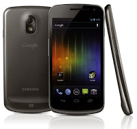
The last 1.5 years has been a wild ride for me, switching from a prepaid dumbphone user to owning a top-of-the-line (at the time) Android phone: the Samsung Captivate for AT&T. It enabled me to work more efficiently and flexibly, and enjoy the benefits of always-on Internet access. But it wasn't without its faults. As I detailed on a previous post (Thoughts on Android), there were a number of issues with the device, and Android in general. The Galaxy Nexus, the first phone running Ice Cream Sandwich (Android 4.0), is, in my personal opinion, the best phone in existence today. I purchased the global GSM version off-contract from an importer, and am using it on AT&T.
Hardware In a world saturated with high-end dual-core phones, including but not limited to: the Motorola Atrix 4G, LG G2X, Motorola Droid X2, etc. bundled with any number of radios and gadgets, the internals to the Galaxy Nexus are quite pedestrian for a high-end phone. Dual-core, 1+ghz CPU? Check. 1GB RAM? Check. 16-32GB internal storage? Check. Bullet points - nothing more. Hell, the GPU is the same PowerVR SGX540 as 2010's Galaxy S and Nexus S phones, and is actually a step behind some recent phones, notably the Mali 400 in the Samsung Galaxy SII and the PowerVR SGX543MP2 in Apple's iPhone 4S. So clearly pretty pedestrian.
What is notable? First, the inclusion of NFC, although this was also on last year's Galaxy Nexus. Second, the inclusion of a barometer, which supposedly helps with GPS. Third — and this is big — a pentaband GSM radio that handles the frequencies of almost all major worldwide carriers, notably AT&T and T-Mobile in the US. One SKU, all GSM carriers.
Although, quite honestly, the most interesting hardware on the device is the screen — a 720p 4.65" Super AMOLED display. Sure, the Rezound beat it to the punch of ~300dpi, but only by a couple weeks. This is, frankly, an amazing screen. I was slightly worried that it would be too big for me. On the contrary, not only does it fit easily in my pocket, the large screen has honestly changed my usage habits. I read on the device a lot more. Long-form reading, too. So far, I've read a good chunk of a book on game theory, the first third of Xenophon's Apology (an alternate record of Socrates' trial that I'm contrasting with Plato's account), and lots of articles on the web that on my Captivate, I would have otherwise tagged for later reading due to their size. The sharpness of the screen helps to this end as well — it's nearly as easy on the eyes for text as the iPhone 4/4S screen. 99% of the time, the fact that it's an RGBG Pentile matrix doesn't bother me in the least — large fields of solid gray look a bit off, however. All-in-all, it's a gorgeous screen.
As far as the industrial design goes... it's pretty nice. It doesn't hold up to the recent high-end designs by Apple or Nokia, but it looks and feels high-end. I love that the front face is just a solid slab of black, unadorned with any carrier or manufacturer logos. Overall, the design is a clear iteration on Samsung's Nexus S from one year ago — the slightly curved screen and overall shape are similar. The Nexus S, however, had a very cheap, plasticky-feeling glossy back cover that just ruined the otherwise great presentation. The textured back of the Galaxy Nexus, by contrast, looks and feels a bit more rugged. It doesn't have the same solid feel as phones made by Apple, HTC, or Nokia, but it's moving in the right direction. If I had one major criticism of the feel of the device is that it feels lighter than it looks like it aught to. In fact, because of it's thinness and lightness, I can't feel it in my pocket, and it's slipped out a few times. I purchased a case for it just to make it feel thicker.
The camera is okay. Better than any camera I'd had on a phone before. It's really, really fast. The speed isn't something I knew I cared about, but after getting it, I've caught a lot more quick, casual pictures of my daughter, and that's something I constantly failed at with my Captivate and my Canon point-and-shoot. The quality is decidedly passable, assuming a fair bit of light. There's really not much else to say; photography isn't my thing. If the camera is really important, this probably isn't the phone for you.
Software But honestly, other than the screen, there's not much too interesting about the hardware. The real story here is Ice Cream Sandwich (ICS). First of all: wow — what a huge change! Most of the complaints I had about Android are gone.
With respect to performance, there's almost no perceivable performance difference between ICS and iOS 5... with a couple of exceptions. The biggest case of slowness is apps that are built for older versions of Android and don't have hardware accelerated drawing enabled. This is a big one, and in normal apps, there's pretty much no excuse for this. In most cases, it requires a line added to an XML file, and then a recompile. But the fact of the matter is, plenty of high-profile apps that at the time of this writing don't do this (I'm looking at you, official Twitter client!) So for a while, we're going to run into this. The second case of slowness is games that are GPU-limited — 1280x720 means a lot of pixels to fill, and the decidedly last-gen GPU isn't always up to the task in some games, particularly compared to the monster GPU in the iPhone 4S. Finally, there's occasionally slowdowns with heavy use of multitasking. Android doesn't put any limits to simultaneous background processes and the like, and I've particularly noticed it when I'm downloading multiple files, which I'm assuming is I/O bound, since the flash memory on this class of devices is quite slow.

Second, the user interface has largely be rethought and redesigned. The first, most noticeable change that the user will observe is the navigation buttons. Android has oft been maligned for the confusing 4 Android buttons: home, back, menu, and search. These are present on all Android devices as hardware buttons. This was particularly confusing if you ever switched phones — it seems no two manufacturers used the same order to the buttons. This is all changed with ICS on the Nexus. First, they removed two of them, search and menu, and replaced them with another: the task switcher button. So at the bottom, you have three: back, home, and task switcher. They disappear when viewing full-screen video and other similar things, which is nice. They provide visual feedback when pressed. And overall, it's less cluttered and confusing. The task switching button is fantastic — with a single tap, it brings up your most-recently-used app list, along with thumbnails of the apps. I rarely used the task switcher on Gingerbread or iOS, because invoking it was annoying (long-tap home and double-tap home, respectively).

The removal of the menu button, as of right now, is both good and bad. It's great if you use apps built to target Honeycomb and later. Instead of a fixed menu button, a contextual "Action Overflow" button may appear in the upper right-hand corner of the app in its Action Bar, which is part of the newer Android 3.0+ UI paradigm. The idea is that if there are more action buttons than can fit into the Action Bar, they go into the overflow area. If, however, you're using a legacy app that targets Gingerbread of prior, the Action Overflow button appears in the extreme right of the navigation bar, to the right of the task switcher button. A small handful of apps, such as Rom Manager, have it in both places! The combination of these two models is confusing at best, but it will go away. It makes me want to recommend against ICS for non-technical users at the moment, because this alone is really, really weird and hard to explain.
Speaking of the Action Bar, I think it's really an improvement to the design of Android apps. The apps that have it typically make good use of it. It has an additional navigational element, often a view selector, and a list of common functions that would otherwise go into a menu, as well as often a pull-down menu. Very functional and intuitive... except what appears to be an alternate "back" button. In the upper-left corner is typically the app's icon, often with a left-facing chevron. When I first got the device, I assumed it was a second "back" button. But it behaves differently than the back button, which just pops views off the activity stack. Though the hard back button is a bit unpredictable for people unfamiliar with the internals of Android, it appeared that we had a second back button that behaved even weirder. However, according to the recently released Android Design documentation from Google, it's not a back button, but an "up" button. Whilst the "back" button simply traverses backward through your stack of Activities, the "up" button goes to the parent Activity or Fragment to the current one. Simple, right? No. It's really not. The fact that I couldn't figure it out without referring to Google's style guide, that implies a failure of design. Seriously, have a look for yourself. Is it a useful paradigm for those willing to read the flow charts? Absolutely. Is it intuitive? Nope. At the very least, it should have been an up arrow rather than a back arrow to give the user a little bit of a clue.
The launcher bundled with ICS is much improved over previous ones. Google clearly took several cues from popular third-party launchers like Launcher Pro and ADW, as well as the stock Honeycomb launcher. It's really, really good. One complaint I have is that I prefer the vertically scrolling app drawer of older launchers to the side-to-side paging app drawer of the ICS launcher. That being said, I'm still using it — it's that good.
The browser is great — it's fast, responsive, and makes great use of the huge, crisp screen. The UI is streamlined, and the navigation controls auto-hide themselves, freeing up yet more screen space for the actual browsing. It take some definite hints from Chome in this regard: the web site is the app, and the best thing the browser can do is get the hell out of the way. The scrolling is quick, although I've seen it slow down a little in image-heavy pages. Again, I suspect GPU fillrate and/or memory bandwidth limitations here.
The battery life is much improved over Gingerbread, at least in the unadulterated Google flavor of ICS. The battery life is really acceptable—I typically have 30-40% left at the end of the day if I stay in Jersey, about 10-20% if I spent all day in NYC.
The new font, Roboto, is a big step up from Droid Sans. It's a lot like Helvetica, and a little like Din. It's overall a nicer, more elegant font. At smaller sizes it's more readable than Helvetica, and a lot of that has to do with the more "open" glyphs, particularly lowercase "e". We'll have to see how it translates to lower DPI devices.
There's lots of other little things... face unlock is neat, but I don't use it for more than showing off what my phone can do. Android Beam is cool... if I'm hanging with one of two others I know with a Galaxy Nexus (why didn't every manufacturer build NFC into their phone?) I haven't yet tried Google Wallet, as there's no support yet. Being able to drill-down and tightly analyze your data usage, and restrict individual apps to never use background data and the like is, frankly, great, but not something the majority of users will use. The keyboard is improved. Cut and paste is finally done right and implemented consistently. And, frankly, the new design of the OS is mostly clean and cohesive, and actually feels like a design, which you really couldn't see in earlier versions.
However, according to Google's design goals, particularly that of simplicity, I think they failed. Because of the menu debacle and the confusing "up" button, honestly they've added complexity. I absolutely love ICS because of the power it gives me. For a non-technical user, my recommendation would still be the iPhone 4S over this phone, unless they make heavy use of Google's apps and ecosystem, or are on T-Mobile. For a serious power user who relies on his phone for work and information, it's hard to beat this phone. And though it has a few warts, I do feel, finally, that Google is really going in the right direction. Hiring Matias Duarte away from HP was one of the best decisions they've made. As nice as Ice Cream Sandwich is, I'm really, really looking forward to Jelly Bean.